

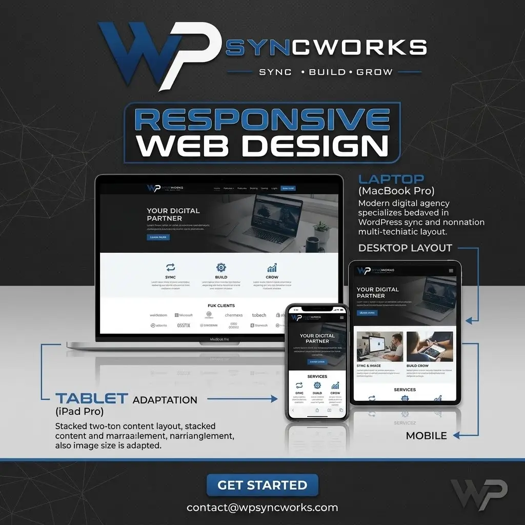



Responsive web design is an essential part of creating modern websites that provide a smooth and consistent experience across different devices and screen sizes. With users accessing websites from smartphones, tablets, laptops, and desktop computers, a website needs to adapt naturally to every screen without compromising its appearance, functionality, or usability.
A responsive website automatically adjusts its layout, images, typography, navigation, and other elements according to the device being used. This allows visitors to browse content comfortably without excessive zooming, scrolling, or resizing. A well-designed responsive layout also ensures that important information remains accessible and easy to understand regardless of the screen size.
Responsive design is not only about making a website look smaller on mobile devices. It involves creating flexible layouts, optimized media, readable typography, touch-friendly navigation, and intuitive user interactions. Every element should work together to provide a seamless experience from the first visit to the final action.
Mobile responsiveness can also contribute to better website performance and search visibility. Search engines place strong importance on providing users with mobile-friendly experiences, while visitors are more likely to stay engaged with websites that are fast, easy to navigate, and visually appealing on their preferred devices.
Whether you are building a business website, portfolio, blog, or WooCommerce store, responsive web design helps ensure that your website is ready for today’s multi-device audience. By combining flexible layouts with thoughtful user experience and performance optimization, businesses can create websites that look professional, function effectively, and deliver a better experience on every screen.